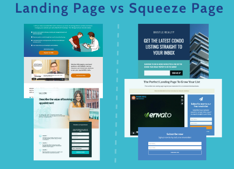
Landing Page vs Squeeze Page: What’s the Difference?
Landing pages serve as a fundamental tool for marketing. But, all landing pages are not created equal. In some cases, a squeeze page may be the right choice. What exactly is a squeeze page? How is it different from a regular landing page?
Today we look at the question, “Landing Page vs Squeeze Page. What’s the Difference?”
If you’re familiar with landing pages, you must have come across the term squeeze page. But what are they? In a nutshell, a squeeze page is a specific type of landing page. They serve one singular purpose – to collect a user’s email address.
All squeeze pages are landing pages, but not all landing pages are squeeze pages. Squeeze pages can be incorporated into blog posts and even pop-ups to gain email addresses from readers and website visitors.
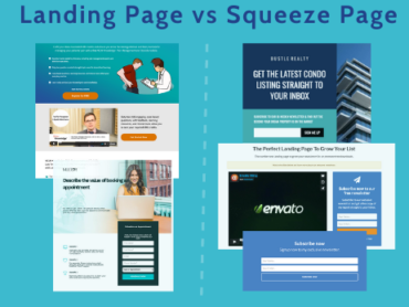
Both landing pages and squeeze pages have similar design principles – header, a call-to-action, appealing visuals, and a form.
The Purpose of Landing Pages and Squeeze Pages
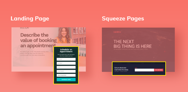
Landing pages are stand-alone pages that aim to achieve one single conversion goal. This could be used for anything from registering for a webinar to trial signups to purchase. Because of this, the information gathered from visitors will vary. You may request their email address, professional title, size of the company, payment information, etc. depending on what the form is for.
A squeeze page, on the other hand, is only designed to extract their name and email address or sometimes just email. While squeeze pages can also be used to offer whitepapers, eBooks, or other lead magnets in exchange for these details, the information requested always stays the same.
According to Alex Mauritz, Market Research Analyst at Illinois-based Chicago Magnani,
Squeeze pages are very similar to landing pages, but more [product] focused. They typically feature just one product and have a very clear call to action in order to get the email. Squeeze pages should be more streamlined, but with less content on the page
What is a Landing Page?
Technically, any page on your website could be a landing page because a landing page is just the page a person lands on. Many businesses make the mistake of believing that their homepage functions perfectly well as a landing page, but this is unfortunately not true.
Setting up specific landing pages is important, especially if you are running ads. Take a multi-product Saas company, for example. If they are running ads targeting people looking for a developer kit, it wouldn’t be good to direct those users to a page featuring all of their products.
This would mean they would have to hunt for what they’re looking for, which could decrease conversions in the long run.
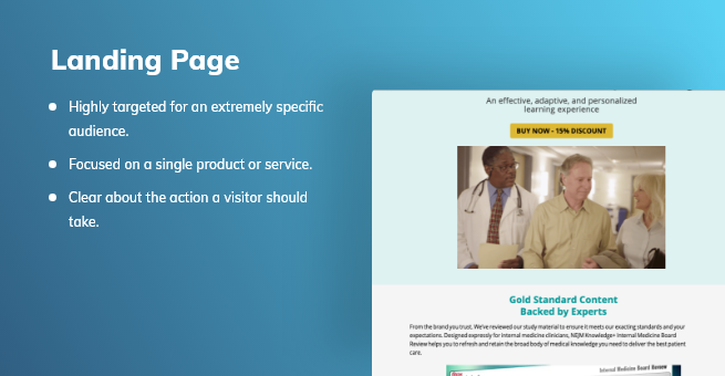
Landing pages should ideally be:
- Highly targeted for an extremely specific audience.
- Focused on a single product or service.
- Clear about the action a visitor should take (e.g. subscribing to a newsletter, leaving a comment, registering for a webinar, and so on).
What is a Squeeze Page?
Squeeze pages are designed to squeeze a user’s email address from them. They achieve this by offering something valuable in return, such as a whitepaper or eBook. On a squeeze page, visitors are encouraged to opt-in to a list for more information about the service or product featured on the page. Squeeze pages can also be designed as popups, though they can be full pages.
Successful squeeze pages don’t just ask users for their details. To provide good conversion rates, they must also provide a good reason for the visitor to part with this information. The offer on the page should be as enticing as possible in order to convince as many users as possible to complete the form.
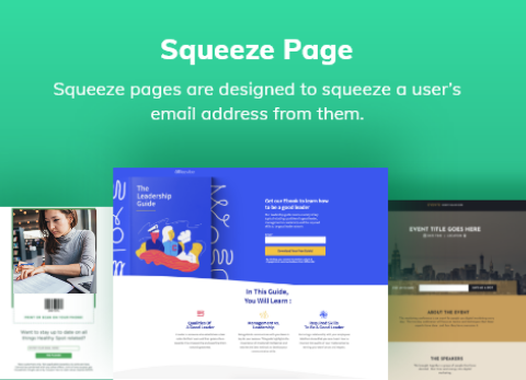
Syed Balkhi of OptinMonster offers users a toolkit for growing their online business in order to start conversations with blog visitors in exchange for their email address. Ideally, the offer you use on your squeeze page should also be exclusive. If you offer users something that they could find somewhere else, such as a video they could find for free on YouTube, not only will they be less likely to fill in your form, they’ll probably also be annoyed.
Squeeze Page is a Type of Landing Page
Both landing pages and squeeze pages have common design principles – both have a headline, a call-to-action, enticing graphics, and a form.
Tammy Duggan-Herd, Marketing Manager at California-based Campaign Creators, points out that the difference between a landing page and a squeeze page is very difficult to distinguish since they serve the same purpose in capturing user information.
People think that a landing page is any page with a call-to-action on it, but in my opinion, a landing page must have a form and exist solely for the purpose of capturing a visitor’s information through that form. This is also the mission of a squeeze page, to have someone fill out a form [for] their email address. So really, a squeeze page is a specific type of landing page. Both pages focus on getting a user to fill out a form. Therefore, the same design principles apply to both
A Squeeze Page’s objective is more specific than a typical Landing Page
Although the intent of both the landing page and the squeeze page is almost identical, the components that make up each page are different. The landing page can contain information to remind the reader of a particular product. But the material on the squeeze page is much shorter and more straightforward. Plus, there’s less distraction on the squeeze page.
Having fewer distractions, as noted by Keri Lindenmuth, Marketing Manager at Allentown-based Kyle David Party, helps users to concentrate on completing the form. This increases the odds of producing more leads.
A squeeze page is a lot like a landing page in that it focuses on one call-to-action or topic. However, where it differs is that a squeeze page nearly forces a user to give their name or email address and become a lead. There’s no navigation, no links, and very few options other than filling out a form.
Why are Squeeze Pages important?
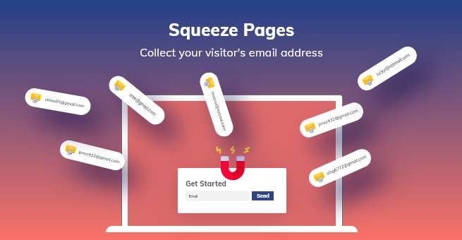
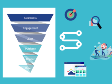
Squeeze pages are valuable because they allow you to collect your visitor’s email address so that you can potentially nurture them to buy something later. When you’re able to grab their email address, you have a chance to drive them deeper down your sales funnel and establish a long-term relationship with them. And this is when “good” marketing transforms into “great” marketing — with long-lasting customer relationships.
What kind of lead-magnet could you use on your squeeze page? Some good ideas include:
- Case study
- Newsletter
- Whitepaper
- Free report
- eBook
- Podcast
- Video or webinar
- Slide deck
Before you begin with the creation of your squeeze page, you need to determine which kind of lead-magnet is going to be most valuable to your prospective leads. If your customers are always on the go, they may find an infographic or podcast more valuable than an in-depth eBook, simply because it’s easier and quicker to consume. Other clients might prefer more detailed content, such as whitepapers, eBooks, or case studies.
There is no right or wrong answer when selecting the type of content to use. Just be mindful of what is most enticing to your visitors.
How are Squeeze Pages Different from Landing Pages?
A post-click landing page is created to fulfill one single conversion goal, though that goal can vary. A squeeze page, on the other hand, is only designed to collect a visitor’s name and email address.
While the offer on the landing page can vary, from downloading an eBook to signing up for a webinar, the ask will always remain the same.
Another difference is your lead-capture forms. On regular post-click landing pages, your form can be quite detailed, with multiple fields. On squeeze pages, however, your forms should be short and concise, as there are only a few pieces of information the page is designed to collect.
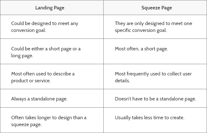
The main differences between the two types of pages can be seen in the table below:
How to Design a Good Squeeze Page
So what should your squeeze page look like? Usually, squeeze pages are short, with only a small amount of text designed to convince users to part with their email address. With so little space to work, how do you create a squeeze page that generates tons of leads?
We have a few tips:
- Include only one CTA: Your squeeze page should only have a single CTA. Your CTA needs to clearly express the desired action you’d like users to take.
- Write compelling, but concise copy: Your supporting context should be both interesting and concise. Make sure your copy is easy to read and provides any information a user would need to want to give you their contact details.
- Make use of social proof: Including a few short testimonials below your form can increase your conversion rates, by showing people that your content has helped people before.
- Use high-quality images: Any images or graphics on your squeeze page should be high quality and captivating.
- Have an enticing offer: You need to make sure that you’re offering something of value if you want to get the most out of your audience. Things like templates, eBooks or webinars make great lead magnets.
As with any type of landing page, there is no guarantee you’ll get your squeeze page right on your first try. Make sure that you keep A/B testing to see what resonates best with your audience. You can test things like form positions, images, copy, headlines, and CTA.
Summing up
Landing pages are stand-alone pages that aim to achieve one single conversion goal. This could be anything from trial signups to registering for a webinar. Because of this, the information gathered from visitors will vary. You may request their email address, professional title, work address, or their payment information.
A squeeze page on the other hand is only designed to extract their name and email address or sometimes just email. While squeeze pages may also be used to offer whitepapers, eBooks, or other lead magnets in exchange for these details, the information requested always stays the same.


